How to Create Mobile-Friendly Email Templates
Learn essential strategies for designing mobile-friendly email templates to enhance engagement and boost conversions.

Over 60% of emails are opened on mobile devices, making mobile-friendly email design a must. Poorly optimized emails risk low engagement, while mobile-friendly templates can boost open rates, click-throughs, and conversions.
Here’s what you need to know:
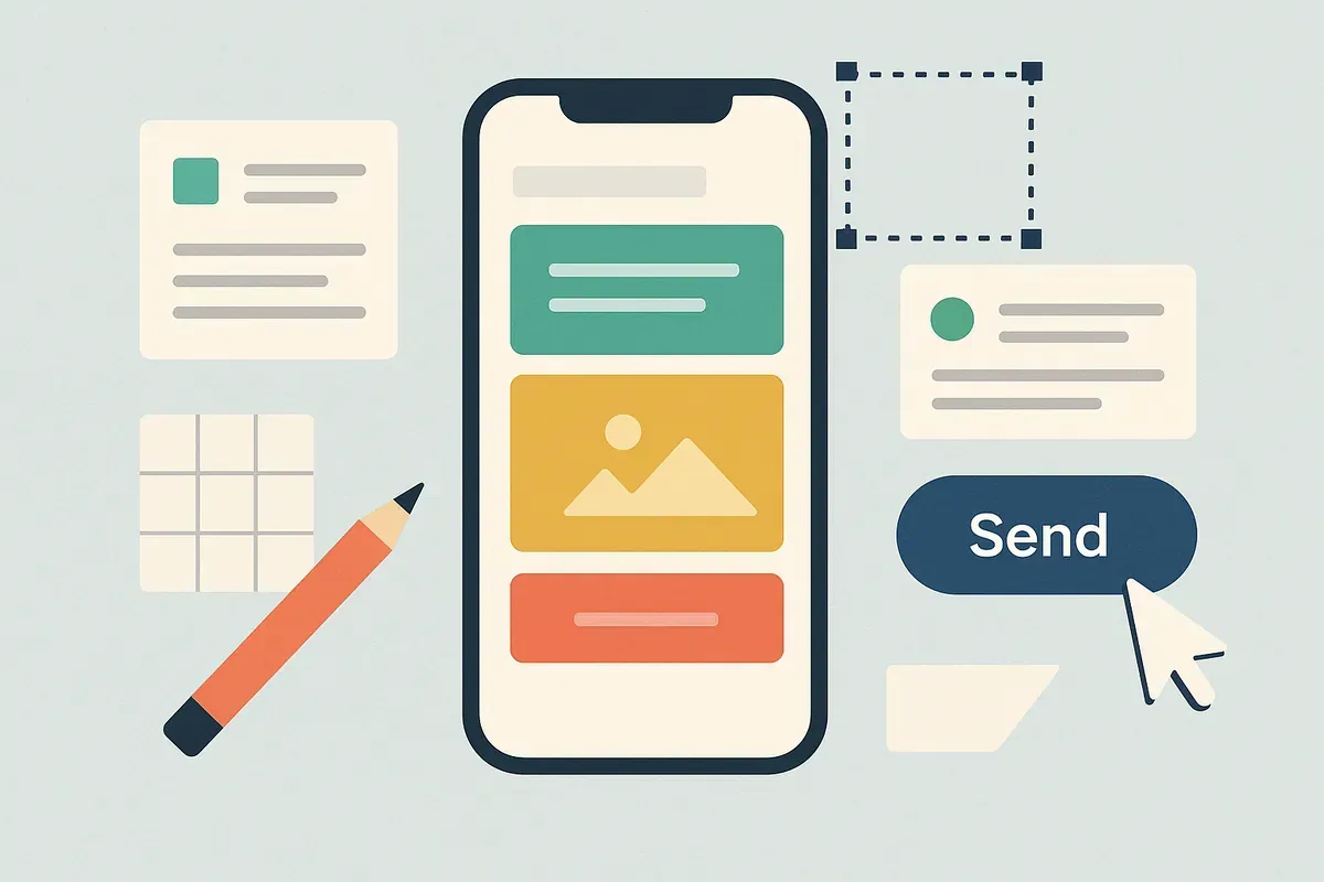
- Responsive design ensures emails adjust to any screen size.
- Use a single-column layout for better readability and no horizontal scrolling.
- Keep text readable with a minimum font size of 14px and ensure buttons are 44x44 pixels for easy tapping.
- Optimize images for faster loading and include descriptive alt text for accessibility.
- Tools like Groupmail simplify the process with drag-and-drop builders, mobile-ready templates, and real-time previews.
Key takeaway: Start with a mobile-first approach, test across devices, and prioritize simplicity to create emails that engage mobile users effectively.
Core Principles of Mobile-Friendly Email Templates
Responsive Email Design Basics
Responsive email design is the backbone of any effective mobile email strategy. This approach ensures that your emails automatically adjust their layout, images, and text to fit any screen size. Why is this so important? Because over 70% of emails are now opened on mobile devices. Without responsive design, your well-crafted message could look broken or require users to pinch and zoom - a surefire way to lose their attention.
By using CSS media queries and flexible layouts, you can ensure your content adapts seamlessly. For example, an image that sits beside text on a desktop will stack neatly above the text on mobile, creating a natural, vertical flow that's much easier to read. This kind of adaptability lays the groundwork for layouts that are specifically optimized for mobile users.
Best Email Layout for Phones
Building on responsive principles, the single-column layout is the go-to choice for mobile-friendly emails. While multi-column designs may work on desktops, they can create unnecessary horizontal scrolling on smaller screens. A single-column layout avoids this issue, presenting your content in a clean, vertical format that aligns with how people naturally scroll on their phones.
This layout isn’t just about aesthetics - it’s about functionality. It improves readability and makes navigation effortless. When someone checks their email on their phone, whether during a quick break or their morning commute, they want to skim and grasp your message without distractions. A single-column design ensures they see your headline first, followed by supporting visuals, your main message, and finally, a clear call-to-action button.
How to Optimize Fonts, Colors, and Buttons
Typography and interactive elements play a huge role in how your email performs on mobile. Start with font size - a minimum of 14px for body text is essential for readability on smaller screens. What looks fine on a desktop monitor might be unreadable on a phone, so testing is key.
Stick to email-safe fonts like Arial, Verdana, or Georgia to ensure consistent rendering across email clients. These fonts maintain clarity even when scaled down for mobile viewing.
Color contrast is another critical factor. Since users often check emails in varying lighting conditions - like bright sunlight or dimly lit rooms - high contrast between text and background colors is a must. Avoid combinations like light gray text on a white background, as they can strain the eyes.
Interactive elements like buttons should also be designed with mobile users in mind. Make your call-to-action buttons stand out with bold colors and concise text. For instance, a "Shop Now" button should be instantly recognizable and easy to tap, even when someone is scrolling quickly. Ensure buttons are at least 44x44 pixels with enough spacing around them to prevent accidental clicks.
Image Optimization for Mobile
Images can make or break your email’s performance on mobile. They need to look great but also load quickly, especially for users on slower connections. The solution? Compress your images to reduce file size without sacrificing too much quality. Large, uncompressed images can lead to slow loading times, which might prompt users to delete your email instead of waiting.
Proper sizing is equally important. Images should typically be 600-640px wide to fit most email layouts. For devices with high-resolution screens, like iPhones, consider using 2x resolution images to ensure they appear sharp and clear.
Don’t forget to include descriptive alt text for every image. This serves two purposes: it improves accessibility for visually impaired users and provides context when images are blocked or fail to load. For example, instead of using generic alt text like "image1.jpg", opt for something descriptive, such as "Woman wearing blue summer dress from our new collection."
To maintain the effectiveness of your message, balance your visuals with text. That way, even if images fail to load, your core message remains intact.
| Design Element | Mobile-Friendly Practice | Recommended Specs |
|---|---|---|
| Font Size | Minimum readable size | 14px or larger |
| Button Size | Tap-friendly targets | 44x44px minimum |
| Image Width | Fits mobile screens | 600-640px max |
| Layout | Vertical, single-column | No horizontal scrolling |
Step-by-Step Guide to Creating Mobile-Friendly Emails
Start with a Mobile-First Approach
Designing emails with a mobile-first mindset means crafting them specifically for smartphones first, then adapting for larger screens. This makes sense when you realize that 64% of emails are opened on mobile devices. By starting with this approach, you can focus on what’s essential and eliminate unnecessary clutter.
This method helps you prioritize your key message while creating a clear visual hierarchy. It also avoids the common pitfall of trying to squeeze desktop-sized content into a tiny screen, which often results in unreadable text and a frustrating experience for readers.
Here’s the good news: if your email works well on a small phone screen, it’s likely to look great on a desktop too. By focusing on mobile first, you ensure your email is both clear and actionable no matter where it’s viewed.
Using Groupmail's Drag-and-Drop Builder
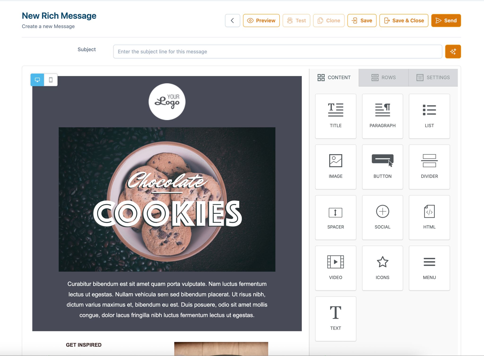
Once you’ve nailed the mobile-first mindset, tools like Groupmail make the design process even easier. This platform’s drag-and-drop builder creates responsive layouts automatically - no coding required. Compared to traditional HTML email creation, this saves time and eliminates the need for manual adjustments.
Getting started is simple. Sign up for Groupmail Free to access their drag-and-drop editor and pre-designed responsive templates. Select the "Rich Text Editor" to begin working in their user-friendly interface. These templates are already optimized for mobile and are updated regularly to stay compatible with evolving email clients.
"Drag & drop email template builder empowers anyone in your team to create professional transactional emails on their own. No coding required!" - MailerSend
With just a few clicks, you can customize templates by adding text, images, buttons, and other elements. The drag-and-drop simplicity lets you focus on crafting your message without worrying about technical design issues. Once your template is ready, arrange the content to suit the vertical scrolling habits of mobile users.
Arranging Content for Vertical Scrolling
Since mobile users scroll vertically, your email should flow naturally from top to bottom. Place your most important message - like a headline, hero image, or special offer - at the very top to grab attention immediately.
Break your email into logical sections that build on each other. For example, start with a bold headline, follow it with a brief explanation or benefit, add supporting visuals, and finish with a clear call-to-action. Each section should stand alone while contributing to the overall message.
Keep paragraphs short, ideally two to three sentences. Long blocks of text can be overwhelming on small screens. Use plenty of white space to separate sections, making the content easier to read and scan quickly.
Pay attention to the "thumb zone", the area of a smartphone screen that’s easiest to reach with a thumb. Placing your most important buttons or interactive elements in this zone can improve engagement by making navigation more comfortable.
Optimizing CTAs and Links for Mobile
Next, focus on making your email’s interactive elements easy to use on mobile. Buttons should be large enough to tap easily, with enough space around them to avoid accidental clicks. Use concise, action-oriented text like "Download Guide", "Start Free Trial", or "Shop Now" instead of vague phrases like "Click Here."
Color contrast is critical for mobile users who might open emails in various lighting conditions. Ensure your buttons stand out from the background so they remain visible whether the reader is outdoors in bright sunlight or indoors in dim lighting. Limit the number of CTAs to one primary action, with a secondary option only if absolutely necessary. Too many options can overwhelm the reader.
Previewing Emails on Mobile with Groupmail
Don’t wait until the end to preview your email. Groupmail’s built-in preview tool lets you check your design throughout the process. Use it after adding major elements like headlines, images, buttons, and text blocks to catch potential issues early.
Look for problems like images that don’t scale correctly or text that’s hard to read on smaller screens. The preview feature also helps identify if buttons are too small to tap or if the layout feels cramped. Fixing these issues before sending ensures a better experience for your audience.
If possible, test your email in both portrait and landscape orientations. Many users switch between the two, especially when viewing images or reading longer content. Your email should look great and function well, no matter how it’s held.
Do's and Don'ts of Mobile Email Best Practices
Do's for Mobile Email Design
When designing emails for mobile, keeping things simple and user-friendly is key. Here are some tips to help you get it right:
Stick to a single-column layout that flows naturally from top to bottom. This ensures your content is easy to read without requiring users to zoom in or scroll sideways. The goal is to make your email feel like a seamless part of the mobile browsing experience.
Make buttons and links easy to tap. They should be at least 44x44 pixels, with plenty of space around them. For text, use fonts that are easy to read - no smaller than 14px for body text and 22px for headlines.
Write short and impactful subject lines that display fully on mobile screens. Most mobile email apps only show 25–30 characters, so put the most important words upfront.
Position your main call-to-action (CTA) above the fold. This ensures users see it right away without scrolling. Emails with a single, clear CTA can boost click-through rates by as much as 371% compared to emails with multiple competing actions.
Test your emails on actual devices. While tools like Groupmail’s preview feature are helpful, nothing beats checking how your email looks and works on different phones and apps.
Don'ts for Mobile Email Design
Avoid these common pitfalls to keep your mobile emails effective and user-friendly:
Skip multi-column layouts. While they may look great on desktops, they often become cluttered or break entirely on mobile screens, making them hard to navigate.
Don’t rely solely on images to communicate your message. Many email clients block images by default, and slow connections can delay image loading. Always include text-based content to ensure your message gets through.
Avoid placing links and buttons too close together. Crowded interactive elements can lead to frustrating accidental clicks. Give each button or link enough breathing room.
Say no to Flash, JavaScript, or non-standard fonts. Most email clients don’t support these, and using them can lead to display issues.
Keep your email size under 100 KB. Large emails with too many images or heavy designs can load slowly or get clipped, especially on mobile networks.
By following these tips, you’ll ensure your emails are clear, fast-loading, and optimized for mobile devices.
Comparison of Key Design Choices
Here’s a quick breakdown of how different design choices perform on mobile:
| Design Choice | Pros on Mobile | Cons on Mobile |
|---|---|---|
| Single-column layout | Easy to read; no horizontal scrolling; adapts well | Limited space for complex layouts |
| Multi-column layout | More content visible on desktop | Can break or stack awkwardly on mobile; may require zooming |
| Balanced text & images | Loads quickly; clear messaging even without images | May look less visually dynamic |
| Image-heavy design | Visually impressive when images load | Slower load times; important info may be missed if images are blocked |
With over 60% of email opens happening on mobile devices, keeping your design simple and focused - like a single-column layout with balanced text and images - can lead to better engagement. A clean, mobile-friendly email ensures your message gets across and encourages action immediately.
Testing and Final Checks with Groupmail
Why Cross-Device Testing Matters
An email that looks perfect on a desktop can fall apart on other devices. Email clients interpret HTML and CSS differently, meaning your polished design might not translate well across platforms.
For instance, Apple Mail and Gmail handle formatting in unique ways, while Android devices and iPhones display content differently. Add in the variety of screen sizes - like the compact iPhone SE compared to larger Samsung Galaxy models - and your email could end up with unreadable text, overlapping buttons, or poorly scaled images.
Cross-device testing is your safeguard against these pitfalls. By catching issues before your email lands in subscribers' inboxes, you avoid frustrating your audience. A single bad experience - like an email that requires horizontal scrolling or has broken images - can hurt engagement and erode the trust you've worked hard to build.
Common problems that arise during testing include text that's too tiny to read, buttons that are hard to tap, images that fail to load or scale, and content that doesn't fit the screen properly. These are all avoidable with thorough testing.
Using Groupmail's Testing and Analytics Features
Our mobile-first design philosophy means cross-device testing isn’t optional - it’s essential. Groupmail simplifies this process with its built-in preview and analytics tools. You can view your email on desktop, tablet, and mobile screens directly within the platform, allowing you to spot and fix formatting issues in real time.
The preview tool ensures your text is legible, your images are properly scaled, and your call-to-action (CTA) buttons are easy to tap and well-positioned. No need to juggle multiple tools - adjustments can be made on the spot.
Once your campaign is live, Groupmail’s real-time analytics help you measure how well your mobile optimization is working. For example, you can track open rates by device type to see if your mobile audience is engaging as expected. If mobile engagement is lagging, it’s a clear sign your templates need tweaking.
The platform also tracks click-through rates by device, giving you actionable data on whether your mobile CTAs are effective. This feedback is invaluable for refining future campaigns.
For a more hands-on approach, send test emails to yourself on various devices before launching your campaign. Set up a small test list with your own email addresses and preview how your email looks across different devices and apps. These practical insights feed directly into the final review checklist below.
Final Review Checklist
Here’s a comprehensive checklist to ensure your email meets all the mobile-first best practices discussed so far:
- Design Elements: Stick to a single-column layout, use at least 14px for body text and 22px for headlines, and make sure your key message and primary CTA are visible above the fold.
- Interactive Elements: Confirm buttons are at least 44x44 pixels with enough space around them. Test all links and buttons to ensure they’re easy to tap without hitting nearby elements. Use action-oriented text for your CTAs to grab attention.
- Images and Media: Optimize images for quick loading and add alt text for accessibility. Check that your email’s message remains clear even if images don’t load. Verify that videos or GIFs function correctly across all major email clients.
- Technical Performance: Keep your email size under 100KB for faster loading on mobile networks. Ensure your subject line fits within 25-30 characters to display properly on mobile. Double-check that your preheader text complements the subject line.
- Cross-Client Compatibility: Test your email on different clients, including Gmail, Apple Mail, and Outlook. Review how it appears in both light and dark modes. Avoid using unsupported elements like Flash or JavaScript.
- Final Functionality Check: Click every link to make sure they work and lead to mobile-optimized landing pages. Test your unsubscribe link to confirm it’s accessible. Ensure any personalization features display correctly with real subscriber data.
This checklist ties together all the steps needed to create an email that performs flawlessly, no matter the device or client. With Groupmail’s tools and thorough testing, you can confidently deliver campaigns that resonate with your audience.
COMPLETE Responsive HTML Email Template Tutorial
Conclusion: Creating Better Mobile-Friendly Emails
With over 60% of email opens happening on mobile devices, designing mobile-friendly emails isn't just a nice-to-have - it's a must. Emails optimized for mobile screens can achieve up to 15% higher click-through rates compared to those that aren’t.
The key principles we’ve covered - like using single-column layouts, readable fonts (14px or larger), tap-friendly buttons (at least 44x44 pixels), and properly optimized images - are essential building blocks for effective mobile email design. These practices not only make your emails visually appealing but also ensure they’re functional and easy to interact with, boosting overall audience engagement. By focusing on mobile-first design, you’re crafting emails that look and perform well on any device, not just desktop computers.
Tools like Groupmail simplify this process with features such as responsive design blocks and an easy-to-use drag-and-drop builder. On top of that, their testing and analytics tools allow you to fine-tune your campaigns on the go, making it easier than ever to align with mobile-first best practices. What once felt like a daunting, technical task is now accessible to marketers and business owners of all skill levels.
It’s worth noting that mobile email design isn’t a one-and-done effort. Email clients change, new devices hit the market, and user preferences evolve. Staying ahead means regularly refining your approach. By sticking to the strategies outlined here and using tools like Groupmail to stay adaptable, you’ll be well-equipped to create emails that engage your audience no matter how they access them.
When you invest in mobile optimization, you're not just improving email performance - you’re building stronger relationships with your subscribers and driving better results. Start applying these strategies to see the difference in engagement and conversions.
FAQs
Why is a single-column layout ideal for mobile-friendly email templates?
A single-column layout works perfectly for mobile-friendly email templates because it ensures easy readability on smaller screens. With this design, your content flows naturally, allowing users to read without needing to zoom in or scroll sideways. It fits seamlessly with the way people naturally scroll on mobile devices, making it easier for them to stay engaged with your email.
On top of that, single-column layouts simplify the overall design, minimizing potential glitches across various email clients. This straightforward structure often requires less testing, ensuring your emails look polished and consistent on any device.
How can I make sure my email images load quickly on mobile devices?
To make sure your email images load fast on mobile devices, focus on trimming down file sizes while keeping the quality intact. Use tools designed for image compression to reduce file sizes and consider saving images in modern formats like WebP, which are optimized for performance. Always resize your images to match the exact dimensions needed in your email layout - this avoids unnecessary scaling that can slow things down.
Another key tip: aim to keep your entire email size under 1 MB for quicker loading. If you can, use a Content Delivery Network (CDN) to speed up image delivery by caching them closer to your recipients. These steps can help ensure a seamless experience for your mobile audience.
Why should you test your email designs on different devices and email clients?
Testing your email designs across multiple devices and email clients is essential to ensure they look polished and work correctly for every recipient. Since different email clients and devices handle HTML and CSS in unique ways, skipping this step can result in layout glitches, broken elements, or inconsistent formatting.
Thorough testing allows you to spot and fix these issues before hitting "send." This not only creates a smooth experience for your audience but also safeguards your brand’s reputation. Plus, well-tested emails are less likely to end up in spam folders or be overlooked due to poor display. Making sure your emails are optimized for all platforms is a crucial step toward effective communication and stronger engagement.