Top 5 Responsive Email Templates for Mobile
Explore essential mobile-friendly email templates that enhance engagement and communication, ensuring your emails look great on any device.

Creating emails that work well on mobile devices is no longer optional - it's essential. With over half of email opens happening on phones, your emails need to look great and function smoothly on smaller screens. Here's a quick rundown of five mobile-friendly email templates designed to help businesses communicate effectively:
- MJML: Open-source components that compile to responsive HTML email, helping layouts stack cleanly on mobile.
- Cerberus: Combines table-based layouts with responsive design for seamless compatibility across devices and email clients.
- Omicron: A mobile-first template with flexible layouts, touchscreen-friendly buttons, and advanced customization options.
- Bakery Newsletter: Perfect for visually showcasing products, it uses hybrid coding for smooth performance on mobile.
- Beefree's Mobile-Optimized Template: A drag-and-drop tool that balances ease of use with mobile responsiveness and customization.
These templates prioritize features like single-column layouts, touch-friendly buttons, and compatibility with major email clients like Gmail, Apple Mail, and Outlook. Whether you're a small business or a marketing team, choosing the right template is key to ensuring your emails look professional and perform well on any device.
Email Design Best Practices | Responsive Email Design
What Makes an Email Template Mobile-Friendly
Creating a mobile-friendly email template is all about ensuring it works seamlessly on phones and tablets. At its core, this means using flexible layouts that adjust automatically to fit different screen sizes.
Start with single-column layouts, which are ideal for mobile screens. While multi-column designs can look polished on desktops, they often become cramped and hard to read on smaller devices. A single-column approach keeps things simple, with content stacking vertically for an easy-to-navigate scroll.
Font size and readability are crucial. For body text, stick to a minimum of 16 pixels, and for headers, go with at least 22 pixels. Sans-serif fonts like Arial, Helvetica, or system fonts are your best bet - they’re easier to read on smaller screens compared to decorative fonts.
When it comes to touch-friendly buttons, size and spacing are everything. Buttons should be at least 44–48 pixels wide and tall, making them easy to tap - even for users with larger fingers or accessibility needs. Adding 10–15 pixels of padding between clickable elements helps avoid accidental taps and keeps the layout clean.
Images need to be optimized for mobile. They should scale proportionally to avoid horizontal scrolling and maintain quality across devices. Don’t forget to include alt text, which is especially helpful when images fail to load due to slow connections.
Email client compatibility is another key factor. Different email clients handle HTML and CSS in their own ways, so test your template across major platforms to ensure it works well everywhere.
Loading speed matters, too. Keep your emails under 102KB so they load quickly, even on slower networks.
Incorporating accessibility features improves the experience for all users. Use high-contrast colors for text and backgrounds to enhance readability in various lighting conditions. Logical heading structures make it easier for screen readers to navigate, and descriptive link text ensures clarity.
Don’t overlook preview pane optimization. On most mobile email apps, subject lines display only the first 35–40 characters, so make those count. Pair them with compelling preview text within the first 90 characters to grab attention.
Finally, design with dark mode in mind. Since this setting is now standard on iOS and Android, your colors and images should look great in both light and dark themes. This ensures your brand stays consistent no matter how users view your email.
1. MJML
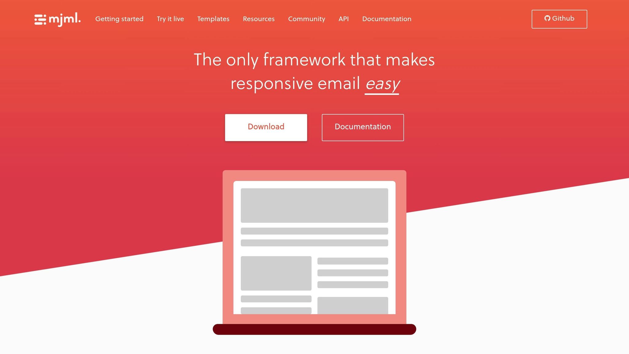
MJML is an open-source markup language for email. You write with friendly components (like sections and columns) and MJML compiles them into robust, responsive HTML that renders well across major clients.
Mobile Responsiveness
MJML’s components stack and collapse cleanly under narrower viewports, with sensible defaults for spacing, typography and images so layouts remain readable on small screens.
This makes emails not only visually reliable but also more accessible to a broader audience.
Customization Options
Work with themes, attributes and CSS to match your brand. Reuse common blocks (hero, features, footer) and keep buttons at 44–48px tap size with generous spacing.
2. Cerberus
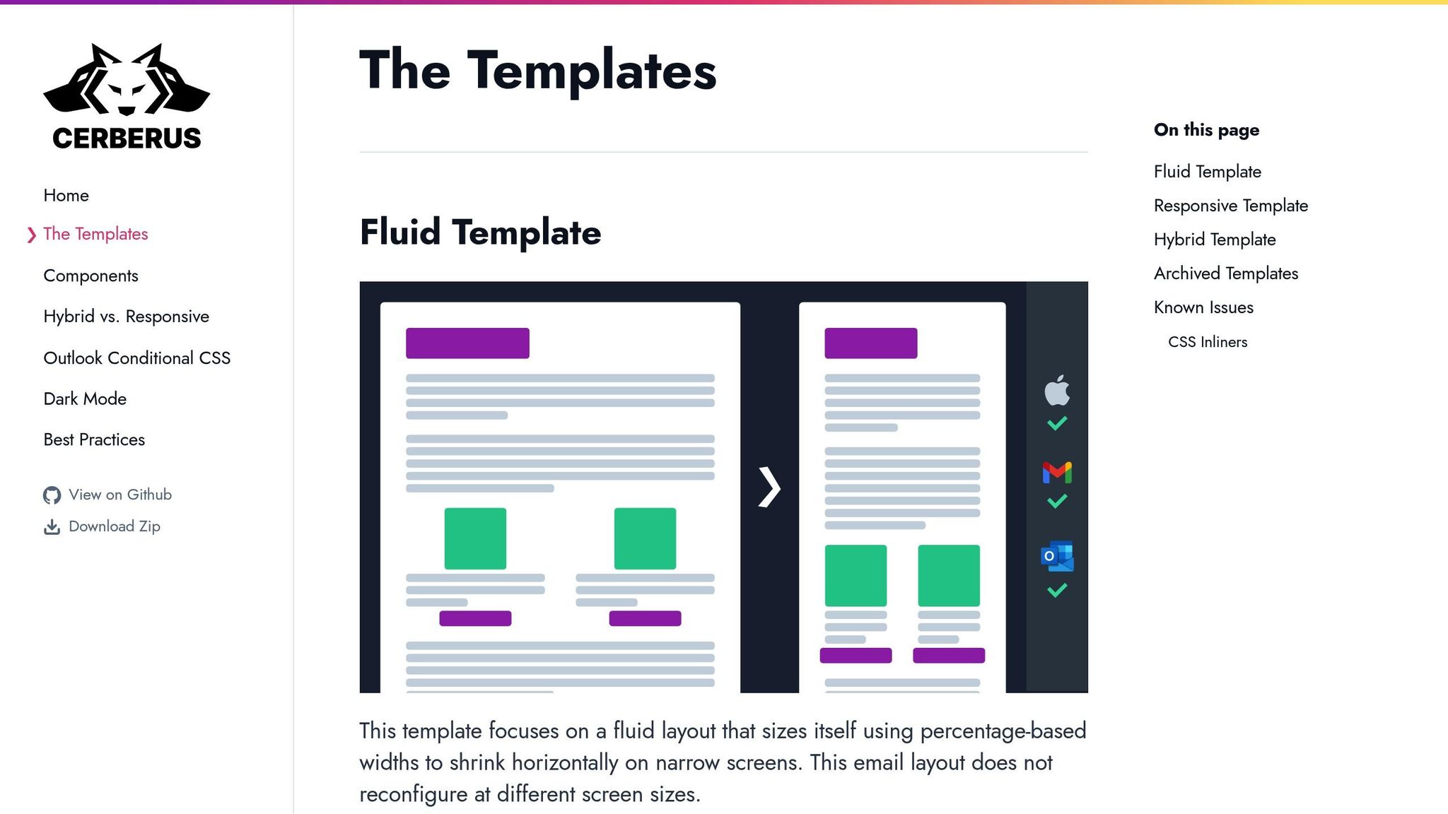
Cerberus is an email template built to tackle some of the biggest challenges in email design: ensuring mobile responsiveness, maintaining compatibility across email clients, and providing a solid code structure. If you're looking for a template that performs well on mobile devices, Cerberus checks all the boxes.
Mobile Responsiveness
Cerberus blends fluid design with table-based layouts to create emails that adapt seamlessly to different screen sizes. Instead of relying only on media queries - which some email clients might not support - it uses table-based structures that naturally stack and resize on smaller screens.
This approach ensures your emails look great on devices like the latest iPhones, Samsung Galaxy models, and other Android smartphones. It adjusts font sizes, button dimensions, and spacing to deliver an easy-to-read experience, even on screens as narrow as 320 pixels.
Touchscreen Optimization
The template is designed with touchscreen users in mind. All clickable elements meet the recommended 44-pixel touch target, making them easy to tap without accidental clicks. To further improve usability, Cerberus typically uses body text sized at 16 pixels or larger, so readers don’t need to zoom in to read your content.
Compatibility with major email clients
Cerberus has been rigorously tested with major email clients, including Gmail, Apple Mail, Outlook (including tricky desktop versions), Yahoo Mail, and AOL Mail. To handle Outlook's quirks, the template employs VML fallbacks for background images and uses conditional comments to include Outlook-specific code. This ensures your email layout stays intact, even in corporate environments using older versions of Outlook.
Customization Options
Cerberus makes customization simple with clearly commented code. You can easily tweak colors, fonts, and layouts to match your brand. Whether you need a single-column format or a multi-column design, the template allows you to adjust settings, swap out color schemes, and incorporate brand-specific fonts (with web-safe alternatives). Modular components can also be rearranged to suit your campaign’s goals.
Next, let’s dive into another template that takes mobile email design to the next level.
3. Omicron
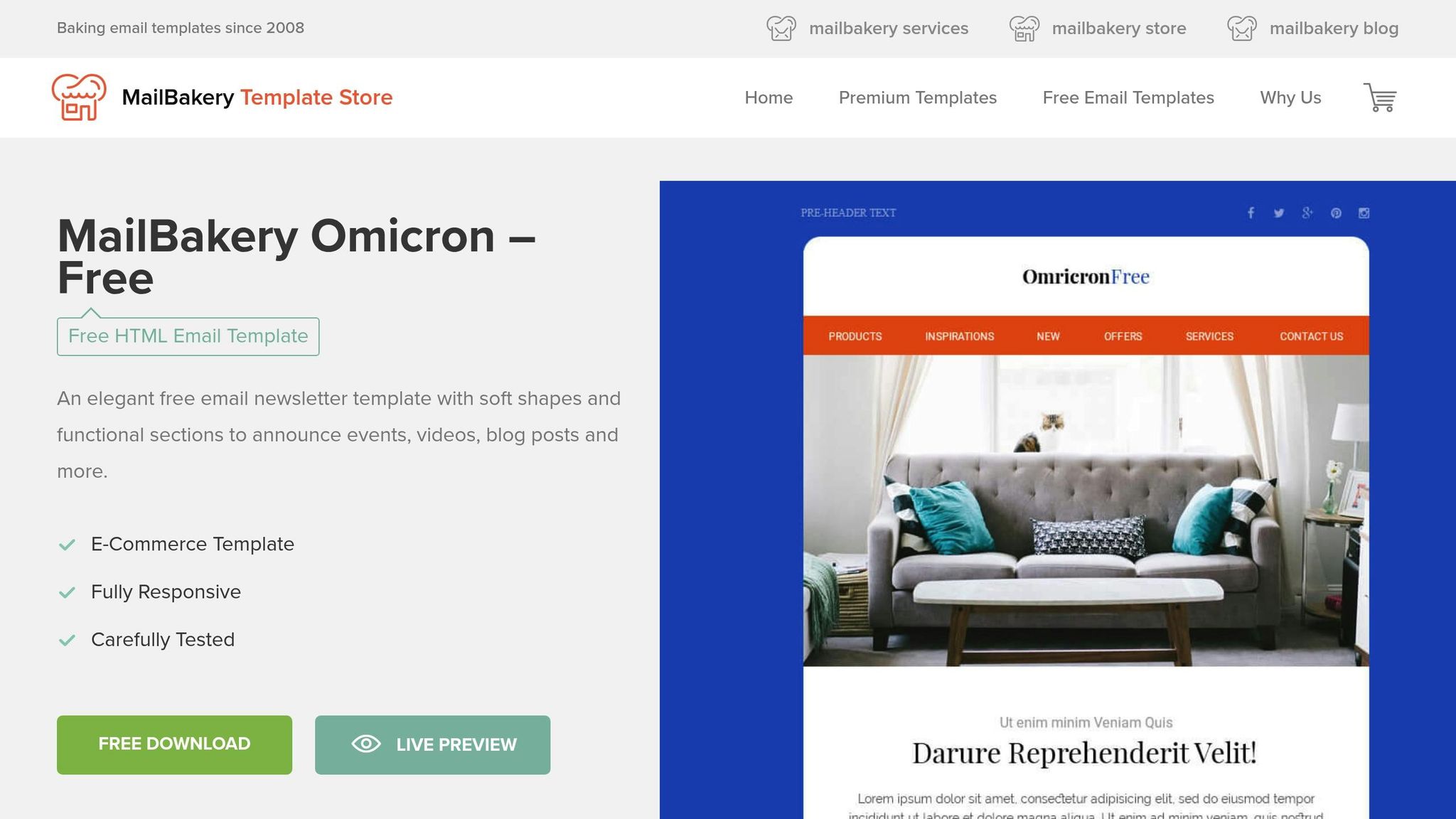
Omicron is designed with mobile usability at its core, ensuring your emails are clear and easy to interact with on any device. By combining fluid layouts with responsive techniques, it effectively handles the challenges of mobile email rendering while maintaining a consistent look across devices and screen orientations.
Mobile Responsiveness
Omicron takes a mobile-first approach, using percentage-based widths and an intelligent column stacking system. For screens smaller than 600 pixels, multi-column layouts automatically shift to a single column, ensuring readability without compromise. The fluid container adapts seamlessly from small smartphones at 320 pixels wide to larger desktop displays.
Headings are responsive, resizing from 24 pixels on desktop to 20 pixels on mobile, while body text stays at a comfortable 16 pixels across all devices. This means users won’t need to pinch or zoom to read your content. With its strong responsive foundation, Omicron also improves interaction for touchscreen users.
Touchscreen Optimization
Touch targets are designed with usability in mind, measuring 48 pixels with 8-10 pixels of spacing to minimize accidental taps. Primary call-to-action buttons are strategically positioned for easy thumb access, while secondary actions are placed in spots that don’t require users to stretch or adjust their grip.
Compatibility with major email clients
Omicron has been thoroughly tested with popular email clients like Gmail, Apple Mail, and Outlook Mobile. It uses conditional comments and MSO-specific code to ensure consistent rendering across platforms. For Gmail, which often resizes emails automatically, Omicron employs CSS that works within Gmail’s limitations while relying on fallback table structures for older clients that don’t support modern CSS.
To ensure typography remains consistent, Omicron uses web-safe fonts with carefully selected fallback options. Whether your email is opened in a cutting-edge mobile app or an older desktop client, the design remains polished and professional.
Customization Options
Omicron offers modular customization, making it easy to tailor templates for mobile performance. Its CSS classes and inline styles are clearly organized, allowing you to:
- Update color schemes by tweaking a few hex values
- Change fonts by editing font-family declarations
- Adjust spacing by modifying padding values
The template includes pre-built modules for common email components like hero sections, product showcases, and footers. These modules can be mixed, matched, and rearranged to create unique layouts without sacrificing mobile responsiveness. Each module is optimized for mobile and comes with detailed comments to guide you through customizing colors, spacing, and content while keeping the design intact.
4. Bakery Newsletter
The Bakery Newsletter template brings a cozy, food-centric vibe to mobile email marketing. It’s designed to highlight products with stunning visuals, all while ensuring a smooth reading experience on any mobile device. Its clean and straightforward layout makes it a great fit for businesses in the food, retail, and lifestyle industries.
Mobile Responsiveness
This template uses a hybrid coding approach, blending fluid grids with media queries to ensure emails look great on screens of all sizes. On desktops, it showcases a two-column layout, but it seamlessly shifts to a single-column format for mobile devices once the screen width hits 480 pixels. This keeps everything easy to read, even on smaller screens.
Images automatically resize using percentage widths, scaling down from a 600-pixel desktop view to as narrow as 320 pixels for mobile. The flexible design stacks banners, grids, and text blocks vertically, eliminating horizontal scrolling and preserving the natural reading flow, regardless of the device’s orientation.
Typography adjusts dynamically, with headline fonts scaling from 28 pixels on desktop to 22 pixels on mobile, ensuring readability without sacrificing design.
Touchscreen Optimization
Touch interaction is a key strength of the Bakery Newsletter template. Buttons are designed with usability in mind, measuring 44 pixels in height and featuring 12 pixels of padding to meet touch target guidelines. An extra 8-pixel spacing between elements further reduces the chance of accidental taps.
Primary call-to-action buttons are carefully placed within the thumb-friendly zone - the lower two-thirds of the screen - making them easy to reach on mobile devices. Secondary navigation links and social media icons are also sized at 40 pixels with ample spacing for smooth finger navigation.
For added convenience, product showcases feature swipe-friendly layouts, perfect for mobile email clients that support horizontal scrolling. Linked images come with larger tap areas, extending the clickable zone beyond visible buttons to enhance the user experience.
Compatibility with major email clients
The Bakery Newsletter performs well across popular email platforms like Gmail’s mobile app, Apple Mail, and Outlook for iOS and Android. It uses VML (Vector Markup Language) fallbacks for Outlook desktop users and employs CSS resets to address Gmail's automatic scaling quirks.
For Apple Mail, the template leverages WebKit-specific CSS properties to ensure emails render beautifully on iOS devices. The structure relies on table-based layouts with CSS enhancements, delivering consistent results even when advanced CSS support is limited.
Gmail's mobile app can strip certain CSS styles, but this template compensates with inline styles and table-based spacing. Media queries are tailored to Gmail’s constraints, maintaining a polished look across all other platforms.
Customization Options
The Bakery Newsletter is built for flexibility, with modular customization options that make it easy to adapt the template to any campaign. Six primary hex values control the color scheme for headers, buttons, backgrounds, and accents, allowing you to tweak the design to match your brand.
It comes with pre-built content modules like hero sections, product grids, testimonials, and footer layouts. These modules can be rearranged or removed as needed, with detailed HTML comments included to guide customization for spacing, colors, and typography.
The template supports custom fonts via web font services, with fallback fonts chosen to maintain readability if custom fonts fail to load. Font sizes use relative units, ensuring they scale appropriately across devices while preserving the visual hierarchy.
For businesses using Groupmail’s mobile-friendly tools, the Bakery Newsletter integrates seamlessly, supporting merge tags and dynamic content blocks. Its clean and organized code structure makes it easy to personalize campaigns without compromising performance. Up next, we’ll dive into Beefree’s Mobile-Optimized Template to expand your email marketing options further.
5. Beefree's Mobile-Optimized Template
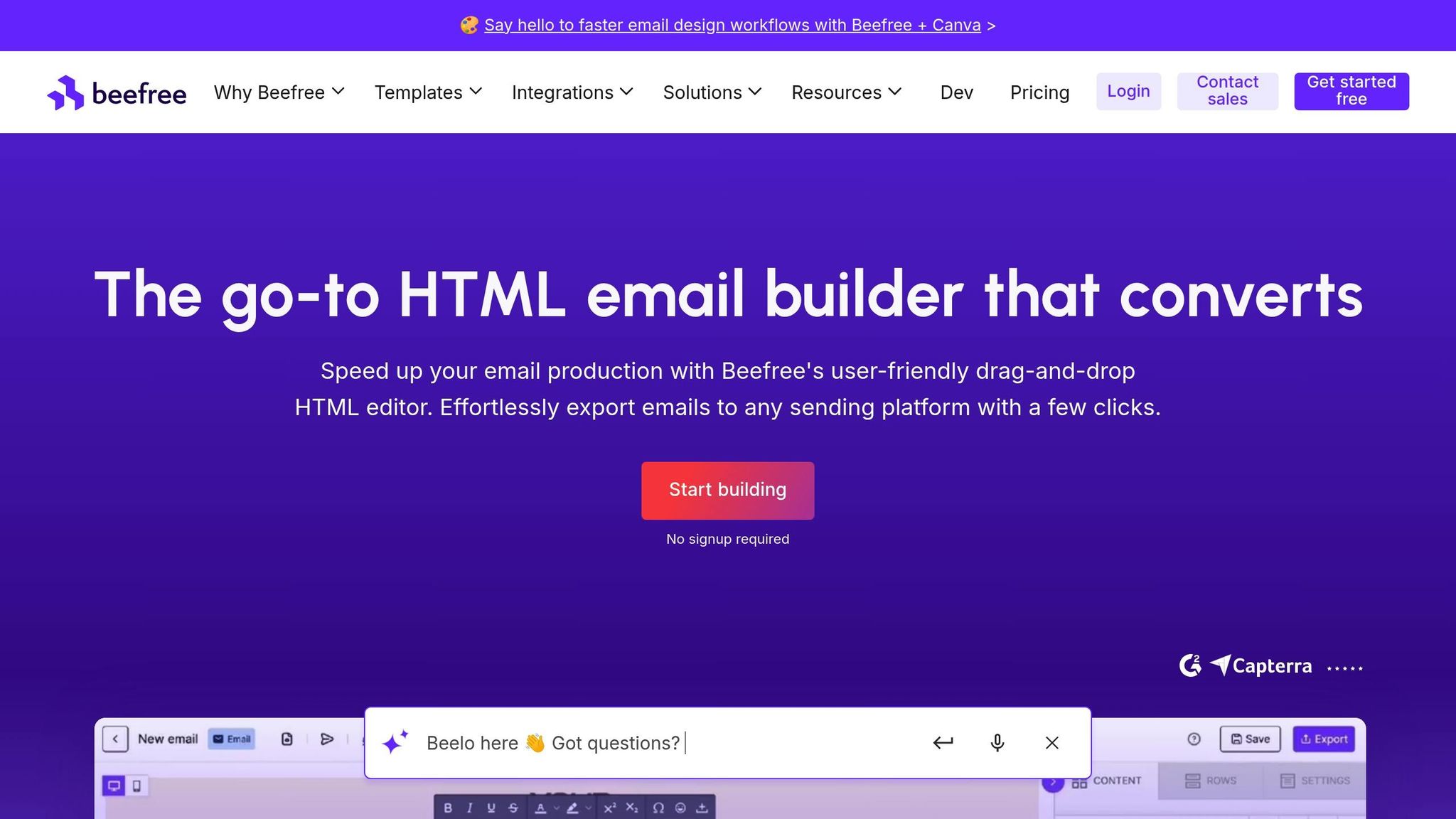
Beefree's Mobile-Optimized Template is a drag-and-drop tool designed to deliver mobile-friendly performance with easy customization. It's especially popular among small and medium-sized businesses, offering a balance of professional design and simple usability. Its modular design makes it a breeze to create polished campaigns that look great on any mobile device.
Mobile Responsiveness
This template takes a mobile-first approach, ensuring it adapts smoothly to larger screens. It starts with layouts tailored for narrow screens as small as 320 pixels and scales up to handle tablets and desktops, accommodating widths up to 600 pixels.
Using fluid table structures and CSS media queries, the design adjusts seamlessly across devices. Images and text dynamically resize for easy readability. For instance, headlines scale from 32px on desktops to 24px on mobile, while body text remains at 16px for consistent clarity. Line spacing adjusts to 1.4em on mobile, making it easier for users to read while scrolling. This responsive setup also supports smooth touch interactions.
Touchscreen Optimization
Beefree's template is built with touch interactions in mind. Interactive elements are designed to meet a 44px touch target with 16px padding, ensuring they’re easy to tap - even for users with larger fingers or those navigating one-handed.
Call-to-action buttons are strategically placed within the thumb zone, roughly 75% from the top of the screen, for easy access. Secondary actions and navigation elements are spaced 12 pixels apart to minimize accidental taps. Social media icons and footer links are sized at 48 pixels with extended tap areas, making them simple to interact with. Additionally, swipe-friendly content blocks allow users to browse horizontally through featured items, perfect for showcasing multiple products or services.
Compatibility with major email clients
The template goes beyond responsiveness, offering compatibility with major email clients like Gmail, Apple Mail, Yahoo Mail, and Outlook mobile apps. Hybrid coding techniques ensure consistent performance across these platforms.
For Gmail, the template uses CSS resets and inline styling to counteract Gmail's automatic font scaling, keeping the design intact. Media queries are carefully structured to fit Gmail’s limitations while staying functional in other clients.
Apple Mail users benefit from WebKit-specific properties that leverage iOS's advanced rendering capabilities. The template also supports dark mode, automatically adjusting colors and contrast when users enable this setting.
Outlook mobile apps are addressed with VML fallbacks and conditional comments, ensuring images and layouts display correctly. The template avoids using unsupported CSS properties, instead relying on table-based spacing and inline styles for reliable results.
Customization Options
Customization is simple and flexible with this template. Modular components allow users to easily tweak colors, fonts, and spacing. At the top of the code, clearly defined CSS variables make adjustments straightforward. It comes with eight pre-built color schemes, but users can also input their own brand colors using hex codes.
Content modules include hero banners, product showcases, testimonial sections, and promotional blocks, all of which can be mixed and matched to suit specific campaign goals. Each module is self-contained and includes preset HTML comments to guide customization.
Font options support both web fonts and system fonts, with automatic fallbacks to ensure readability across devices. Pre-configured font stacks include popular choices like Arial, Georgia, and Helvetica, and the template also enables Google Fonts integration for brands looking to use custom typography.
For businesses using Groupmail, the template integrates seamlessly with dynamic content and merge tags. Its clean code structure ensures that personalization can be implemented without disrupting the mobile-friendly design, making it easy to create targeted campaigns that look great on any device.
Template Comparison Chart
This chart breaks down key features of various responsive email templates, helping you find the one that suits your needs. It covers mobile responsiveness, touchscreen optimization, customization options, pricing, and platform compatibility.
| Template | Mobile Responsiveness | Touchscreen Optimization | Customization Level | Pricing | Platform Compatibility |
|---|---|---|---|---|---|
| MJML | Fluid grid system, 320px-600px range, CSS media queries | 44px touch targets, thumb-zone CTA placement | High - modular components, custom CSS support | Free | Gmail, Apple Mail, Outlook, Yahoo Mail |
| Cerberus | Responsive breakpoints at 480px and 600px | 48px minimum touch areas, swipe gestures | Medium customization with pre-built variations | Free | Gmail, Apple Mail, Outlook mobile |
| Omicron | Mobile-first design, fluid tables, responsive images | 44px touch targets with 12px spacing | High - drag-and-drop builder, brand customization | Free | Apple Mail, Gmail, Outlook 365 |
| Bakery Newsletter | Adaptive layout, 320px minimum width support | Touch-friendly navigation, 46px button sizing | Low - template-based with color/font changes | Free | Gmail, Apple Mail, Yahoo Mail |
| Beefree's Mobile-Optimized | Mobile-first approach, 320px-600px scaling | 44px touch targets, thumb-zone optimization | High - modular design, CSS variables | Free + Paid | Gmail, Apple Mail, Outlook mobile, Yahoo Mail |
Key Takeaways
- Free Templates: Options like MJML and Cerberus offer great starting points but require a bit more technical know-how to customize effectively.
- Mid-Tier Choices: Tools like Beefree (free + paid plans) and simple “Bakery Newsletter” style templates provide user-friendly interfaces and better support for non-technical users.
- Premium features: Omicron offers advanced modules and clean, mobile-first blocks — ideal for teams needing robust layouts without heavy coding.
All templates integrate smoothly with Groupmail, thanks to its clean code and standard HTML support. Groupmail's mobile-ready system complements these designs, offering unlimited email sending and real-time analytics, ensuring your emails are optimized for mobile users.
When selecting a template, consider the importance of 44px touch targets and proper spacing for a seamless mobile experience. Templates with high customization levels are perfect for maintaining brand identity and creating unique designs, while low-customization options are better for quick, no-fuss email deployment. Weigh your team's technical expertise and time constraints to find the best fit for your email marketing strategy.
How to Pick the Right Mobile Email Template
Choosing the perfect mobile email template means balancing your business goals, technical skills, and budget. To make the right choice, focus on a few key factors that ensure your emails look great and perform well across devices.
Start by understanding your audience's mobile habits. If your analytics reveal that many subscribers open emails on their phones, prioritize templates designed with mobile-first principles. Templates like Omicron and Beefree's Mobile-Optimized Template are excellent options, as their fluid layouts adjust effortlessly to different screen sizes.
Match the template to your team's skills and budget. If your team has coding expertise, free templates like MJML or Cerberus can be great options. For teams without technical knowledge, look for drag-and-drop templates that are easy to customize. Be sure to balance upfront costs with the potential need for future adjustments.
Testing is non-negotiable. Don’t rely solely on desktop previews. Send test emails to various devices and apps to ensure layouts, touch targets, and visuals function properly on real smartphones and tablets.
Next, think about how the template fits into your broader marketing goals. Make sure it aligns with your email strategy. Templates should work seamlessly with tools like Groupmail, which supports unlimited sending, clean HTML, and responsive designs. This ensures consistent rendering across major email clients.
Plan for scalability. As your business grows, you’ll need templates that can evolve with your brand. Options like Omicron and MJML offer extensive customization, making it easier to handle advanced features and complex layouts without starting from scratch.
Ensure integration with Groupmail’s features. Groupmail’s drag-and-drop email builder pairs perfectly with responsive templates, maintaining mobile optimization even as you tweak designs and content.
Track performance to refine your approach. Use Groupmail’s real-time analytics to monitor metrics like click-through rates and conversions. This data will help you identify which template styles resonate most with your mobile audience.
Conclusion
In today’s mobile-driven world, having email templates designed for mobile devices isn’t just a bonus - it’s a must. With most people reading emails on their phones, a well-designed, mobile-friendly template can make all the difference in how your campaigns perform.
The five templates we’ve covered - MJML, Cerberus, Omicron, Bakery Newsletter, and Beefree's Mobile-Optimized Template - each bring something unique to the table, catering to different technical needs and budgets. But no matter which one you choose, one step is non-negotiable: testing.
Make sure to test your emails across various devices to ensure they display correctly and that interactive elements like buttons work seamlessly.
For even more control over your designs, tools like Groupmail can be a game-changer. Its drag-and-drop builder, unlimited sending capabilities, and real-time analytics give you the flexibility to fine-tune your templates while keeping them responsive.
At the end of the day, the best template and platform are the ones that can grow with your email marketing goals.
FAQs
What should we look for in a mobile-friendly email template?
Prefer single-column, responsive layouts with readable font sizes and generous tap targets. Ensure images scale with descriptive alt text, and test in light and dark modes across major clients.
How do we avoid layout breaks in Outlook or Gmail?
Use hybrid/table-first patterns with modest media queries. Set explicit container widths, inline critical CSS, and lean on proven patterns (e.g., MJML or Cerberus) for cross-client reliability.
Any quick size rules for better performance?
Keep HTML lean (aim under ~102 KB), compress images (WebP where possible), and make buttons at least ~44–48 px with clear spacing to prevent mis-taps.